Reverberations:
Weeks 5 and 6:
- The Gothic cathedrals use stone and glass to juxtapose each other and to allow minimal light inside
- The immense height and beauty of the cathedrals create a rhythm, like music
- Each region had their own understanding of how a cathedral should be designed
- The cathedrals' main purpose was to remind citizens of God and to tower over the landscape
Weeks 7 and 8:
- To go against the Gothic cathedrals, the Renaissance movement was focused on landscape
- The Renaissance was also interested in writing down rules for architecture
- Feeling the constraint of the Renaissance rules, the Baroque period sought out to break them
- People started to move outside the box and experiment with materials
Weeks 9 and 10:
- After America broke off from Great Britain, the colonies knew they had something to prove
- America used architecture and design to great trust in the government
- America began collecting other worldly objects to show off their wealth
- The Industrial Revolution brought about change to materials
--------------------------------------------------------------------------------------------------------------------------------
The Music of Reform and Revolution
Plato once said, “Music and rhythm find their way into the secret places of the soul”, but I believe that music and rhythm find their way into secret architecture too. For, is architecture not designed from the heart and the soul? In Europe, the Gothic cathedrals held the most presence and music in the region. Because of the grand scale and height of these cathedrals towering over the landscape, the music most associated with these buildings were consistently low in pitch, so that the echoes don't mash and sound confusing. The voices humming were often that of men, since men were considered the head of the church and the religion. But in contrast with this deep hum, in Russia, the songs would reflect a much different tune, that of high pitched instrument moving across the different notes, reflecting how the eye would constantly move up and down to gaze upon and to try to comprehend the beautiful buildings. Mexico has a much different attitude about how architecture should look and sound. Their architecture is stone based and limited to what stone can do, making their buildings heavy, which in return, would make the sound and rhythm of a heavy drum.
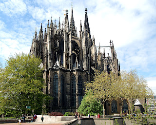
Cologne Cathedral, Germany
Church of the Savior on Blood, St. Petersburg
Temple of Inscriptions, Mexico
As time goes on, the middle ages start to emerge, along with maps. But the maps that people started to acquire aren't like the maps that we used to today, these maps include codes, and relative locations of landmarks. An example of a landmark that people would use in Europe is a Gothic cathedral; because of their massive height, it would be easy for someone to recognize. But the height of the cathedral wasn't only used for people to find their way on Earth, it was also used to help people find their way to Heaven by essentially pointing a big arrow to the sky. With this, we see an emphasis on religion and the trinity within the church by repeating groupings of three throughout. The church was meant to be a safe place, where people could escape the worldly troubles of the "dark ages", so in another words, it was supposed to be the light within the dark. But the light that the church allowed into the space was minimal. The windows were often small, since glass could only be made in small squares, they were often only at the very top of the building, and they were stained to become translucent, instead of transparent. Even though cathedrals seem to follow the same rules, each different region had their own thoughts about what a cathedral should emphasize. For example, Germanic cathedrals have two towers at the entrance and a smaller one in the middle of the building, where the cross meets, whereas in England, the entrance is marked with three towers along with a taller one in the middle. Feeling the constraint of the church and the unsureness of the architectural rules, people wanted to break free and create rules of their own. So they did.

Lincoln Cathedral, England
Cologne Cathedral, Germany
Salisbury Cathedral, England
Salisbury Cathedral, England
St. Peter's Cathedral, Germany
Instead of height becoming the emphasis, in the Renaissance, width was. Property taxes were based off of how much land the house took up, and so if your house was wider than it was taller, than it meant that you paid more taxes, which is just one way that people showed off their wealth and power. But to be able to measure one's wealth, there would have to be rules. The Renaissance is one of the first times that architects started making rules about design and how buildings should look to be called "good architecture". With all of these rules in architecture, it is sure to affect the people living in them. During this time, people became interested in rational thinking, and to them, relating back to antiquity for architectural advice was sensible. They borrowed the notion of groves and stacks, along with looking at other geometry. That's when the "ideal city" first arose. The concept of combining circles and squares was started by Leonardo de Vinci when he drew "The Vitruvian Man", which shows how the human body is made using circles and squares. In architecture, the circle in the "ideal city" was considered to be based off of the classical columns and to symbolize the perfection of God. Although both the east and the west followed these rational rules, there was one major distinction between the two worlds. The east saw the value in the past buildings and focused on restoring foundations, rather than tearing them down, but in the west, an old building is just an available spot to put a more modern one. But all in all, the main focus of the Renaissance was rules, which makes sense that the Baroque period would be all about breaking them.

Versailles, France
The "Ideal City" plan
Plan of Castel del Monte, Italy
The city of Palmanova near Venice
The City of the Sun as described by T. Campanella
"Vitruvian Man" by Leonardo de Vinci
The Baroque period was able to break away from the Renaissance's neat and orderly rules to create some very interesting pieces of design. These designed objects went throughout different scales, including buildings and objects, mainly. Even though they Baroque design went through multiple sizes, the breaking of the rules were still the same. The main theme in all design then was movement and how to bend the rules of what materials are supposed to do to make them suggest movement. For instance, in the architecture, the facades were created to have more three dimensional objects protruding from them, rather than having a nice clean, flat, front. The same was applied for chairs during this time. The Renaissance chairs were made to fit perfectly inside a box, with the wood being straight and doing what it is supposed to do, but the Baroque broke that box and curved materials out of the box, creating fluidity and curved details. This sense of fluidity made it back onto the architectural level in stairs. Stairs were curved and the steps were placed so that the bottom would seem as if the stone were water pouring out into the open space. Instead of the notion of "frozen music" that was found in the middle ages, we now see the idea of "frozen movement" within all design elements.

San Carlo alle Quattro Fontane, Italy
Renaissance Chairs
Baroque Chairs
Michelangelo's Laurentian Library stairway, Florence
The Baroque period went on until the early 18th century, and by the time it ended, America was being born. Colonial expansion brought a whole new perspective to the world, but before their perspective was worth anything, Americans had to prove themselves. Since this was a country that is brand new, many believe that it is a savage land with savage people, so the colonial people in America decided to express their sturdy, new found land through architecture. To prove their abilities, the architects turned to classical architecture. For example, the presence of both Greek and Roman architecture is clearly present in Monticello, designed by Thomas Jefferson, by the dome and the use of columns and portico. Another way that colonials showed a strong unity and balance was by showing it in their houses. The faced of the houses were normally symmetrical and materials were continued through out the outside of the house. Now that the 13 Colonies knew they had a presence in the world, they started to compete with the rest of the world in the buildings they designed. Since America was new, they didn't have factories to produce building materials, all they had were raw materials, so they decided to open up trade routes with England to get their manufactured goods. Because of these new found trade routes, people in colonial times wanted to be other worldly; to travel and collect objects from other countries and to bring them back to show off in their homes. This not only proves that they have the wealth to travel, but it also shows that they have obtained knowledge from other countries.

Monticello, Virginia
Triangle Trade Route
Tea Party by Henry Sargent
America Guided by Wisdom by John Janes Barralet
Along with gaining experience and knowledge from other places, they gain new materials from their own land because of the Industrial Revolution, which began in the 1800s. During this time, new jobs were made, and people started to explore new materials that they can create or make useable with the new machinery they built. With these new materials, new architecture arose. Steel was being mass produced to be used to support glass in buildings and green houses. A few year after the Industrial Revolution ended, the United States went entered the Great Depression, and with the Great Depression came poverty, inflation, and lack of trust in the government, so to regain trust, America had to go back to it's roots and show stability like the 13 colonies did in architecture, only this time it is with money. The government showed both symmetry and repetition on the Dollar bill, just like architects showed it in houses. For example, the Great Seal that is on the back of the bill shows an eagle with a palm branch in one talon and arrows in the other, representing peace and war, but the eagle is turned towards the peaceful sign. The eagle also has "E Pluribus Unum" written above it's head, meaning "one out of many" in Latin. This is purposefully stated because the Dollar bill was created when money was scarce, but having a document that says that there are many of this monetary form made the people in the Great Depression feel relieved.

Crystal Palace, London
United States 1 Dollar Bill
United States Great Seal