Labels

Showing posts with label Design Visualization 112. Show all posts

Friday, April 29, 2011

St. Mary's house Writers' Retreat


          The first picture is of my parti. I cut a board into the shape of the plan of St. Mary's House and planned out where I would want my different rooms to be, and along with those rooms, the colors that they will be are represented. I wanted the study to gray to have the room be formal, but the living room would be inviting, warm, and dramatic, while having the gray incorporated throughout. The kitchen is yellow because it points towards the east, where the sun rises, which would light up the entire kitchen. The next picture is of the furniture plan at a 1/4th scale. The living/ reading room would contain enough seating for 20 people, with extra chairs in storage. I put a desk and computer in the bedroom so that the writer would be able to get up during the night or in the morning to jot down any thoughts. The dining room is located where the alter is, keeping to the fact that dining would be ritualistic since our last project was about dining. The third page is of all the sections. I have two transverse and one longitudinal. The fourth page has two perspectives, the top one is standing in the dining room, with the wall ghosted, looking into the kitchen. The second is of the dining room while standing in the living/reading area. On the final page is the living/reading room. The fireplace is kept in the same place as it was originally and the reading space is located right next to it with a foot step up. 

Monticello vs. Falling water


          Our studio went on a trip up to Monticello, designed by Thomas Jefferson, and Falling water, designed by Frank Lloyd Wright. So, as an assignment, we had to compare and contrast the two houses. Falling water is this beautifully modern designed house that is located right atop a waterfall, surrounded by trees and rocks. Whereas Monticello is this older house, on the top of a mountain, with a few patches of trees around it. On the page, I created the composition to mostly contrast the two buildings by lining up different aspects of each house. The first drawing is the landscape, the second is looking out a window, the next is an object indoors, then a room, and the next is an object outside. I made the drawings of each place melt together, to show the relationship. I had the drawings of Falling water break the borders on every side, whereas Monticello's drawings were kept inside a box for the most part, making sure that there is a distinct border. 

Studio Perspective #3


          With these last 2 perspectives, I wanted to experiment. I already did the outside rendering before, but this time I added scale figures, objects, and even some animals to give the space life. I also rendered on a different type of paper. Before, i ued copy paper, but the new one was vellum. Vellum really took the marker in a different way than the copy paper. The next rendering of the inside studio space is one that I hadn't done before. Our assignment was to choose someone else's bone structure and render the drawing. I added more color than usual to it, making up my own colors and showing how i wish the studio spaces were. I added more life with the scale figures and the colorful paper on the bulletin board. 

Studio Perspective #2


          Our assignment was to pick a place from about 9 different pictures that were from around the studio building, one that we hadn't done before. Since the inside of the building is mostly gray concrete, I wanted to take advantage of the beautiful weather and the different colors. This was the first assignment that i had to practice rendering, so naturally, I practiced a few times before continuing to the final. I layered the brick with a dark brown on the bottom, and a crimson read over top. The poured concrete was rendered using a light gray was layering it by circling all throughout the floor. The columns were created the same, but with a lighter marker. I used the same light gray for the windows, but used the in a linear fashion to create a streaking effect. I used a black colored pencil in the brick (only horizontal lines) to hint at the brick texture and layout. I also used a green colored pencil in the bushes. Since I didn't have a green marker, I mixed about 3 of them together to create a layered look. 

Studio Perspective #1


          The assignment was to pick from about 9 different spaces that were around the Gatewood building, so recreate the picture by drawing a one point perspective. I picked this space because i thought the architecture and the railing would be interesting to draw and to make it my own. I started with drawing the horizon line and then finding the vanishing point and extending the lines of the objects.  I then created the seating area, then the door and overhang, and then the railing. Next I added the windows and drew a circle on the page so i knew where my focal point was and where I should add value and texture. I made the windows dark because that is how they look during the day. I added the scale figures only into the circle that I drew for my focal point. 

Dining Project


          Or project was to create a place for dining that is to stop world hunger and to use technology to bring people together, like social networking. My technology was the transitioning windows, which would bring people together by having the atmosphere around them be pleasant. We also had to create our own table and sideboard while choosing an already existing chair. I wanted my table to be round because it symbolizes equality. Since that was the most important object to me, I put it along with the plan and section on the first page. The next one consists of the axonometric and the sideboard. I wanted my sideboard to be clear because I wanted to keep the room open and also let the food stand out. The last page is filled with the one point perspective of my dining space. I wanted to make it the focal point and the biggest thing on the presentation because perspectives let people get a feel of how it is to be inside the space. 

Tuesday, April 5, 2011

Falling Water Extra Credit

Falling Water
        Falling Water is considered one of Frank Lloyd Wright's greatest creations. In this building, he focused on the horizontal bands that continue throughout the entire house, even in the materials he used. I favor this house over Monticello because of it's concept. Just the idea of creating this beautiful home over an equally beautiful waterfall is bold and easy to admire. But to go along with this grand idea, he had another thought to tie the entire house together, since it seems to be in parts. Even though the structure wasn't given much thought, the people who would inhabit the place were constantly in thought with balancing the  intimacy and the grand scale of the environment.
        The floor plan is left open to allow the space to feel as open as the woods that surround it. Also, the openness helped the Kauffman's to make the house their own with decorations and collectable from all around the world, which they did. In the study room, there was a staircase that was surrounded by exotic books and baskets that were hand weaved. Mrs. Kauffman continued the fill the house with sculpture and statues that she bought from Mexico when she would go to her house there. Even the paint of the covered walkway has the color scheme of Mexico, being almost a creamy salmon color.       


The main floor 

Monday, February 21, 2011

Color Week


        I was pretty excited about color week when we started it because it was a nice break from everything drafting and using my brain for project ideas, but I did think Tommy was a little insane when he tried to explain to us how we would see "lines of colors" in the middle color. 
        Our first assignment was to make a 3"x3" square by picking two colors, and then finding the middle color. The next one was to make a cross, by once again, choosing two colors and picking the middle color. If you got a close middle color then it would look like the pieces of colored paper, the ones we picked, were overlapping. The third assignment was to make the five squares (four on the corners and one in the middle). We chose four colors, and then a separate one, and found the median with each of the four colors to the one in the middle, making the corners look as if they overlapped. Since my four corners were all blue, it made it difficult trying to find which shade of blue went with which color. We next were instructed to make a color pallet in which we would use throughout the semester. I tried my best to not have any purples or greens in my pallet because they are my least favorite colors and I didn't want to be stuck using them, so I tried all different color combinations but no matter what, I had a color I didn't like. We had to first choose two colors and a median to be in the middle. Then we had to pick a light color and a dark color that we compliments of each other to be at the top and the bottom. Then find each color that went in between each color. Although half of my pallet is purple, I am still satisfied with the way it turned out. The last project with color was to, using our color pallet, make an abstract representation of how we view the four seasons. For spring I curled strips of paper to make "grass" and used bright colors. For summer is used all warm colors and cute shapes our to make it look like they were melting, like of like a lava lamp. For fall, I wanted to show wind by cutting strips and making them stand up in a wavy style, while using dark, neutral colors. Finally, for winter I used stark blues and purples, cool colors, in a jagged fashion, as if ice were breaking. 

Dining Precedence


        For my three precedences, I chose, for my eating style, the way of Delhi, India. I wanted to capture, in my dining space, the humbleness of sitting on the floor and eating like commoners, where everyone is equal. I also wanted to not have utensils because in India, they believe that eating should be an all sensory experience, and I think that silverware is just a way of distancing, just like buying prepackaged animal meat, the person eating from their food. I wanted everything to be intimate. 
        The second one is my table. I wanted to bring back the idea of people and animals gather around the water circle as a community. It seems that in this age, people don't seem to gather like they should to have quality time with each other, so I wanted a circle table, just like the eating style, to bring everyone together and to make them all on the same level. 
        The final precedent is about the table as well. Showing, again, how animals gather around water and how circular tables make for equality, just like  the knights at the round table. 

Material Value Study


        I am very proud of my material value study. This was, I think, the first check plus I got on an assignment this semester. Starting from the left and moving to the right,  chose to do bamboo for my wood flooring, then looped carpet, then a type of granite tile, and last a textured textile. We used both pen and pencil, which I decided the group the value studies by material, rather than medium. 
        At this point, I was already very comfortable with shading with pencil, but not to much with pen. Ink usually makes me nervous because I know that you can't erase it once you mess up, so I knew I had to practice. The zoomed out pen was actually a happy accident, I didn't know when I was doing it on my final that it would turn out so nice and so much like bamboo. With carpet, I knew that all I had to do was the dreaded stippling that takes so long and is so tedious, but I knew I had to do it to accurately depict how the carpet reacted to different lights. The zoomed out tile was also a unintended. I didn't think that what I was making was a grout line with the tile until someone mentioned it. But the textile was a little harder to make accurate and believable because it has such defined stitch lines. 

Value Study


        From the left moving right, the first three rows are with pencil, then the next three are pen, and then marker. I was used to using pencils because that is all we sketched in last semester. But, this was one of my first times using the pens that we bought, although I came to love them because of the way the ink isn't always consistent and creates value. Even though I had used the pens once or twice, I had never used the markers because, and they were my worst fear. I wasn't sure as to how they would bleed, blend, overlap, get lighter, get darker, and just do what markers do. 
        For each medium (pencil, pen, and marker), we practiced three different ways of coloring. The first was regular shading, then the next was hatching, then stippling. The shading was easy because it was what I was used to. It was easy to go back and make darker if need be. Hatching was very intimidating, in fact, it was pretty revolutional in my mind, that shade could be made just by a matter of pencil thin lines. On the other hand, stippling was the technique I was dreading the most. It seemed to tedious, and it was. To just sit there poking at the paper, baring having any immediate gratification. But, I knew that just listening to a song while doing it would ease the pain. I also knew that the marker stippling wouldn't be my worst enemy since markers bleed, I would only have to do about half the work to get the same effect. 

Dining Space Sketch Models


        For my sketch models, I wanted to focus on the room, rather than the object inside of it. The top picture is of the ceiling, and how I would want the flow in the room to go. I wanted Japanese umbrellas to mark the door, leading to the sideboard, where it gets a little lower, and then from the sideboard to the table, where it gets a few feet lower. 
        The bottom picture is a representation of how the walls will look. I want the walls to be curved at the top, to mirror the circular table and to enclose the room to make it more intimate. I was unable, at this point, to figure out how to show my table in a model, and still had troubles all the way until the day before the project way due.

Social Networking Parti/ Models


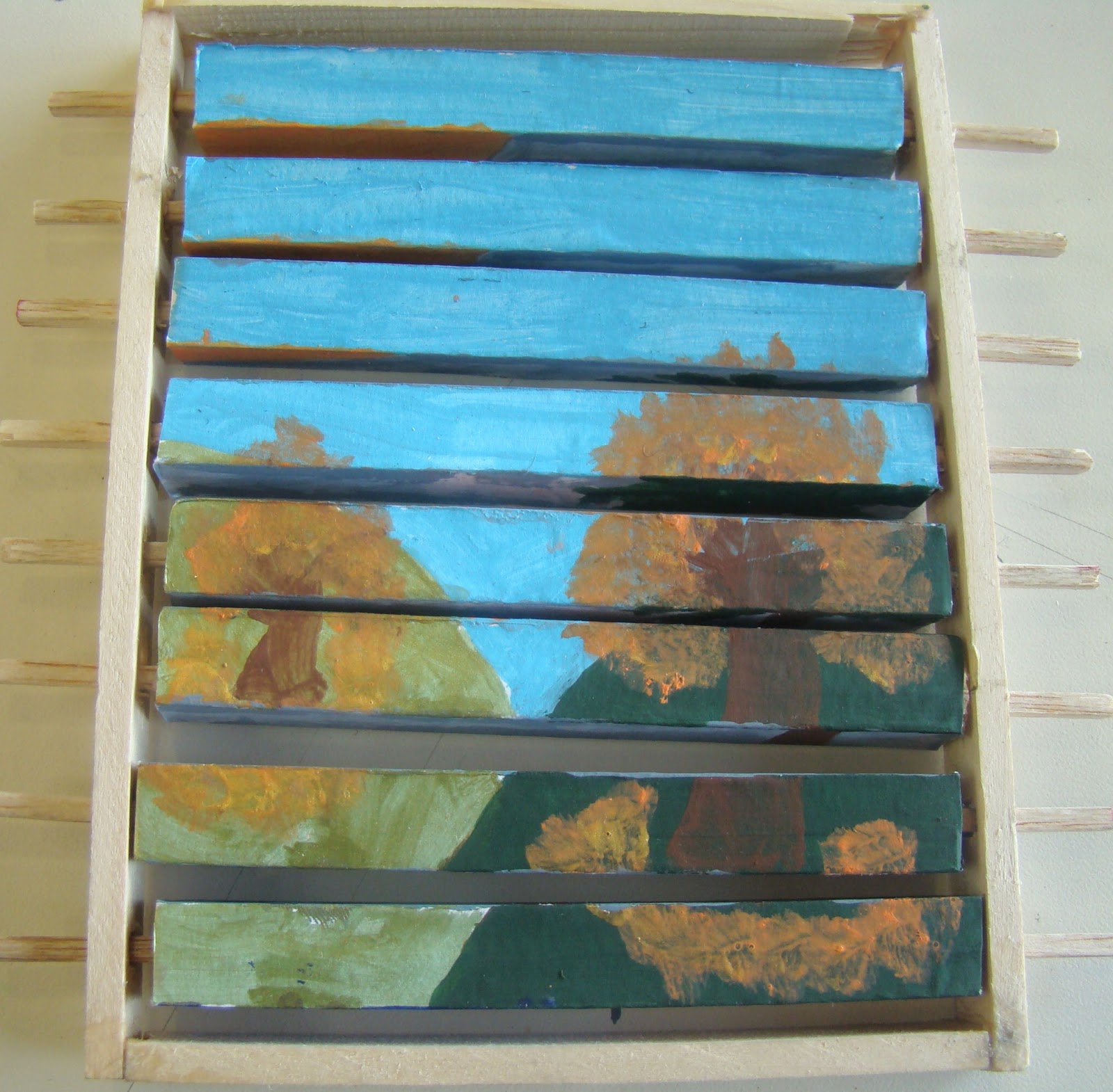
        For my social networking device I wanted to bring people together, not set them apart like computers do. I chose to create "transitional windows", which would allow people to change the view outside, making their time together more enjoyable. 
        Although the concept for my design would be fairly easy with technology, making it from wood, paper, and paint was difficult. First, I cut the wood into two equal parts to make the sections that rotate. Then I carved, using an exact-o-knife because my cutter broke, I carved out the size of the small wooded sticks, so that I can glue the two bigger pieces together with the smaller piece in the middle. 
        Secondly, I created the the two side panels to hold the sections that rotate. I then preceded to cover the rotating sections in white copy paper, holding it together with rubber cement. After, I put the pieces together and started to paint each side. One side was a rainy day, another was a beach scene, the next was a spring field, and the last was a fall hillside. Once I put the pieces together, I noticed that the model was wobbly and unstable, so I added the top and bottom pieces of wood to hold all of the pieces together  and for stability. 

Dining Parti


        For my parti, I wanted to show the eating style, the table, and the chairs (along with how I would incorporate each country). 
        I wanted the eating style to reflect India. I have pictures showing people eating on the floor, in a very humble manner. But, after talking to Stoel and measuring classmates' preference on table heights, I knew that I had to have chairs. Stoel wanted to have something to lean up against and support his back, so I knew I wanted something low to the ground and comfortable, but I wasn't sure what type of seating I wanted, like whether I wanted it to be a couch that wraps all the way around the table, or a seating for a couple so people could get out easier, or individual. It was obvious that I needed to think more about the chair.
        Since I wanted people sitting on the floor, or on a low chair, I knew that my table had to be pretty low. But I also knew that I wanted it to be circular, like the Knights at the round table, showing equality and also a place whether people aren't only going to talk to the person they are sitting with. The shape of the table I wanted is a water hole because since the beginning of time, people and animals have been gathering around water.
        For the sideboard, I originally wanted it to represent Japan, but I decided to have it represent Egypt and the pyramids. Japan was represented by disc type things on the ceiling that mirror how a Japanese umbrella could look. The united states would be in the technology on the walls, which would be my transitional windows all the way around. As I mention before, India is the eating style, and China is the seating. 

Tuesday, February 8, 2011

Babette's Feast

        Culture is normally defined as "the set of shared attitudes, values, goals, and practices that characterizes an institution, organization or group", but what I think should be added to the list is design. Just by looking at an object, building, or space that someone creates from a certain culture tells a million stories. If an image is worth a thousand words, just image how many would be used for an entire building!
        In Babette's Feast, we see a conservative village, with minimal houses, roads, food, and color. All the houses look the same and nothing is personal. This is a reflection of the society. For instance, the Puritan society believed that having excess or anything you don't NEED is a sin and against God. Because of this thought, there were people walking, not driving, people dressing in greys, blacks, and tans, not our colorful patterns we have today, and people living in the bare minimal environments. The lights would be simple and non-electrical, the houses would have simple designs, and the atmosphere would be non-existent.
        Babette was from France, a place that is known for the relaxed life with expensive delicacies such a wine, caviar, and snails. She then moved to a speck in Denmark, working everyday for free, and eating food that has no flavor. To this blan culture, she wanted to introduce some of her culture. Not only did she consider the food as her culture, but also the atmosphere, the objects, and the feelings. The china, the napkins, the glasses, all aspects of her culture. The lighting, the wine, the sparkles off the silverware, all what she wanted to convey of France. It is obvious to tell what Babette feels are the most important and dominant features of her culture and her past life by the objects she chose to introduce to a completely different place and way of life.


Thursday, February 3, 2011

Design Manifesto

            
Design, to me, is to let yourself go free. Growing up, I was never one of the “artistic” kids that made works of art in their notes while in class, I could only draw the same three things. My mom is an artist and I just never thought I had the skill or imagination to create something, until I became an Interior Designer. These classes have gotten my imagine back from when I was a little kid jumping on object, so I won’t “land in the lava”.

I used to think that designers only decorate, and not create. That there was no element of craft within the field because all they did was lay fabric on couches or hand paintings on walls. And for a while, that’s what I wanted to do. But now, I not only know what design truly is, but I know what aspect I want to be within it. I want to create objects and spaces in which people will marvel. I want to help the function of humanity by designing things they will use daily.

I believe a criteria for wanting to be a designer is to have faith in your ideas. The first idea may not be the final product, but it definitely gets you to one. I always think of what Tommy said they first day of class about failing, that we never “fail” at an idea or by creating something because we learn from our “mistakes” and trials.
Over the few months of me being a “designer”, I have marveled over some of the creations my classmates have created, some of which I would pay for! I don’t get jealous that I didn’t come up with the idea, I just admire their work and progress, just like I do with mine. Everyone has a different background and different ideas to bring to the table. It’s great to look around at what people are creating and build on it. I find that our peers are our best resource in design.


Sunday, January 30, 2011

Social Networking in Chile


Top 10 Social Networking Sites In Chile


FOTOLOG.COM            2,824
Blogger                             2,577
Facebook                          2,019
Wordpress.com                 1,392
Windows Live Spaces      1,391
Yahoo! Geocities                905
Flickr                                   660
Hi5                                      497
Sonico                                 493
Lycos Tripod                      346
http://www.hitsearchlimited.com/news/999931/

-Chile's use of social networking Web sites is the highest in Latin America, and numbers have surpassed North America as well
-7 million Chileans have Internet access either at home or at work and, nine out of 10 of these people use social networking Web sites such as Facebook and Twitter.
http://www.santiagotimes.cl/news/1-other/19520-chiles-use-of-social-networking-web-sites-highest-in-latin-america


-88% of the population lives in urban areas (2008)
https://www.cia.gov/library/publications/the-world-factbook/geos/ci.html
-The population of Chile on January 1st 2010 is approximately 17,052,473
http://www.trueknowledge.com/q/chile's_population_in_2010
0-14 years: 23.2% (male 1,966,017/female 1,877,963)
15-64 years: 67.8% (male 5,625,963/female 5,628,146)
https://www.cia.gov/library/publications/the-world-factbook/geos/ci.html
-Chileans also use networking sites to blog about social problems, like when 80 prisoners died and 20 got seriously injured when their cell block caught on fire.
http://globalvoicesonline.org/2010/12/19/chile-prison-fire-sparks-debate-on-social-networking-sites/

Social Networking Sites Show Destruction in Chile


But, social networking has a negative side
-A sexual awakening is happening through a booming industry for 18-and-under parties, an explosion of Internet connectivity and through Web sites like Fotolog, where young people trade suggestive photos of each other and organize weekend parties, some of which have drawn more than 4,500 teenagers. The online networks have emboldened teenagers to express themselves in ways that were never customary in Chile’s conservative society.


-Chilean society was shaken last year when a video of a 14-year-old girl eagerly performing oral sex on a teenage boy on a Santiago park bench was discovered on a video-hosting Web site.
-Chile has become Latin American’s biggest per-capita consumer of digital technology, including cellphones, cable television and Internet broadband accounts.
-Chileans are plugged into the Internet at higher rates than other South Americans, and the highest use is among children ages 6 to 17. Therein lies a central factor in the country’s newfound sexual exploration.
-Party promoters use Fotolog, as well as MSN Messenger, to organize their weekend gatherings, inviting Fotolog stars — the site’s most popular users, based on the number of comments they get.

-Fotolog is a photo-sharing network created in the United States, took off in the last two years in Chile. The country has 4.8 million Fotolog accounts, more than any other country. Children ages 12 to 17 hold more than 60 percent of the accounts.
http://www.nytimes.com/2008/09/13/world/americas/13chile.html?pagewanted=2&_r=1