Labels
- Design Visualization (12)
- Design Visualization 112 (18)
- Studio 101 (16)
- Theory of Design (27)
Showing posts with label Theory of Design. Show all posts
Monday, February 20, 2012
Design Autobiography 2: Manifesting God
For my map of my object, I chose God to be the "founding father" or the starting point. From God, both light and color were created. As an act of trying to control color and light, humans created the prism, where light is shown through an object and shows color. The prism then became a gem once humans realized that it is beautiful without having to tranform anything. This map shows how humans try to manifest God and rationalize things he has created.
Thursday, January 12, 2012
Design Autobiography 1
As a designer, I am bright, purposeful, and colorful.
Alone, the gem is attractive, but when paired with light, the gem becomes something much more magnificent. Knowledge is my light, and when armed with it, I know that I can be outstanding.
Each cut in the gem is meaningful and joined to make a larger picture that is brilliant. In 1919, Marcel Tolkowsky created a mathematical formula for cutting round gems to maximize their brilliance. When refracting light, the top of the gem will create an arrow pattern and when viewed from the bottom, a heart pattern is formed. When designing, I want each aspect of my work to be purposeful and when combined, to create something worthwhile.
I believe that color has the ability to control a person’s mood. For example, when in a bright yellow room, one might feel happier and joyful, whereas in a monochromatic dark blue room, one might feel melancholy or depressed. I would love for my work to be able to have that big of an impact on someone. I want to surround my peers, clients, professors, and family with the colors and feelings of happiness.
For the main culture, the gem would symbolize power, wealth, status, class, and beauty. For the subculture that mined the gem, it would symbolize slavery, death, repression, and poverty.
Thursday, April 28, 2011
Blog Post 14
Design Influences
Object: Recipes
I love to cook. I love to do anything that is related to cooking, whether it be reading recipes, watching food network shows, or actually baking. Some people claim that the bible is actually an acronym for Basic Instructions Before Leaving Earth, and to me, thats what recipes are. they are things you should try before leaving Earth. They are just these simple bullet points filled with instructions on how to create a wonderful meal. But they can be much more; once you change the recipe its yours. I get inspired by watching shows that have all of these steps to creating one dish, and then I start to wonder how I can change that and make it my own, which is what designers do. They see a sculpture and wonder how they can incorporate it into their work.
A picture is worth a thousand words, and i want to be the one that inspires them. Fields, to me, are like a blank canvas. never ending possibilities, and your only boundaries are the sky, the earth, and the trees surrounding it. There is no path you must walk upon, no people to judge you, and nothing to conform to. A field can be someone's dream turning into a reality, or a house for a beginning family, or an photo album bursting with mental images and memories.
People communicate more with gestures than with words. But I think feelings and auras have a lasting impression. I find the act of standing at a train station, and watching people hug goodbye or kiss hello is worth while. There are such string feelings connected to both acts that it cannot be erased from the space. Just looking at a bench there, I can sense the thousands of joyful and depressing stories that have happened there. How many tears have fallen, how many kisses were given and how many "I love you"s were said. The feeling is more powerful and overwhelming than any sappy love story could capture.
Place: Nature
What is more well designed than nature? What is more influential than nature? Nothing. Nature has inspired people, cities, states, countries, continents, and worlds throughout history, so why stop now? As I look out the window, all i see is well sculpted trees, beautifully painted leaves, perfectly placed roses, and sky as wide as eternity. This is how i think all architecture and design should be. To state it simply, nature satisfies all elements of commodity, firmness, and delight. To me, nature is worth everything, nature has been around longer than man-kind, and it is designed in God's image. Tell me that is not something worth emulating.
Monday, April 18, 2011
Extra Credit
After the in-class discussion today, I know clearly see the difference in today's view of design and past views of design. When looking at the biographies of the stars on Design Star and Design on a Dime, the view is that anyone can design, even without formal education, and to some degree, I agree. Anyone can draw, imagine, or paste together a chair, but not everyone can create a well crafted object, that is what schooling does. It provides the facts, like building codes, joinery methods, and other things, but it can also provide opinions. For example, I receive most of my inspiration from other people in my studio, but inspiration is nothing without the facts on how to create it. Schooling also allows people to step out from their comfort zone of only rendering accurately to being more loose and creative with it. Instead of designing the same mirror frame a million times with a new color, college can help you turn that mirror into something that you would have never thought possible because with other people t hat are majoring in the same thing around, you have more experienced input and opinions to contemplate. Which leads to how important credentials and experience is in the design world.
I know from first hand experience that credentials mean the work for most people. My boyfriend moved to north carolina about a year ago and has yet to get a job, no matter how many people he calls, emails, and meets, he still has no job, and it's because he doesn't know anyone that lives here to give him credentials. He has plenty of experience is most fields, but because he doesn't personally know someone that previously or currently worked in the job he can't seem to get one. Experience is also equally as important and crucial to getting ahead in the world. Even though college can be considered experience, most people want working experience, outside of college since it can give you worldly knowledge and real life experience; experience that cannot be substituted. For example, a designer may not know exactly how to create something where all parts work as a whole until they try, which proves that holistic design is everything in Interior Architecture.
The whole is greater than the sum of its parts. A well designed object, space, building, or place is nothing if everything doesn't work together, like the parts of a clock. If the delight is aspect is missing from the commodity, firmness, and delight, in a piece, then it isn't considered a well designed object. Repetition must occur in an object to make it holistic. If metal is the base for a chair, then a designer should let it continue to the arms or the back of the chair, to allow the eye to follow the metal all the way through. But this skill comes to designers from trial and error and through life experiences, which each person learns differently.

Each designer brings something different to the table, that's why most projects are group oriented. But in Design Star, the show makes the audience believe that one designer is creating everything that they see in a matter of minutes, when instead it is collaborative and can take months to plan and become a reality. Media diminishes the reputation of design, making it seem that design is easy, for everyone, and fluff. It also makes it seem like only mirror frames and rooms can be designed, whereas magazines, chairs, electronics, and even ADs are designed. I hope to get out into the world and show through media how dedicated a true design is and debunk all the myths that are being spread.
Blog Post 13
Simply Scandinavian
The Scandinavian modern design has taken simple objects and taken them to a different level, to where the object is designed far beyond what the term explains. For example, the Bronsa Bookcase above doesn't seem like an ordinary bookcase. The Scandinavians have developed the concept of what a bookshelf is way beyond what it is intended to be, and even beyond recognition, turning it into something even better. This design is sleek, clean, plain, geometric, and smooth, which is exactly what Scandinavian design is about. The bookshelf cuts out the unnecessary ends, making the use of material less and less expensive. The open ends even make the object possible to be a something even more when introduced to more than one. This open design is the equivalent to an open plan on a building; both allow the owner to take control of the designed object, space, building, or place, and make it their own and to incorporate their style with it. Unlike the "modern" movement that took only beauty into account, Scandinavian modern design takes the consumer, customer, and owner into consideration when creating products.
http://www.scandinaviandesigns.com/home_storage_bookcases/item/2530
Reading Response 13
Frozen Movement
In this class already, we have studied how architecture is frozen music, but I believe that it can be much more than that. I believe that architects in the 1950s was trying to capture movement in their work. For example, "Saarinen's TWA Terminal at New York's John F. Kennedy International Airport was conceived as a bird with its wings spread and poised to take off" (Ching 768). Saarinen was given the task to create an airport, and what is more suited to the task than capturing the movement of flight itself in a building? Another example of The School of Ballet, National Schools of Art in Havana. One of the three rules of design that the buildings had to abide by was that Catalan vaults had to be used as the primary structural system (Ching 773). Even though this rule was followed, it was used in a way to capture the spirit of what the building was by forming the vaults into the shape of ballerina toes and the way they bend when on stage. In Roth, Corbusier was mentioned as following this idea that buildings should embody what they are going to be used for. When Corbusier created the Notre Dame du Haut, he kept in mind when it was going to be used for, which was mostly housing for nuns. On page 552 Roth states, "The swelling roof of Ronchamp suggested many things- a nun's cowl, a monk's hood, a ship's prow, praying hand." Even though architecture can be frozen movement, I still agree that it can be frozen music, and that is exactly what the Berlin Philharmonic is. Each level of the rows is based on how music travels and bounced off of objects and gets redirected (Roth 554). This new movement of architecture being movement is moving away from the modernism, which takes beauty only into account, whereas frozen movement takes the client and the purpose into more consideration.
Wednesday, April 13, 2011
Reading Response 12
Columns Around the World
It all started with Greek architecture as Roth claimed when he said that 20th century machines possessed the same elegance of form and functions as the Pantheon (p. 530). From there, people have been looking back in time to study the architecture in Greece and to look at how they can adopt the columns for their own purposes. For example, in the Villa Savoye, the columns "lifted [it] free off the earth", which in return, made it seem lighter and also allowed for the 20th century automobiles becausethe turning radius of an automobile determined the curvature of the glass wall of the ground floor..."(Roth p 531-532). Even in India with the Ghettinad House, the same integrating of columns was happening but for a different reason. the Europeans were taking over the Indian culture and architecture, but it was time to fight back quietly."Designed to look like European on the outside, they were on the interior distictly more local, with a touch of the Indonesian in feel and design" (Ching 673). Back in Europe, the opposite was happening. Germany wanted to relate their culture back to Asia through architecture. The Yenidze Tabakfrabik "bloomed forth in an Oriental style, even using simulated minarets and a glazed dome to conform to the branding of its cigarettes", (Ching 702). the reason why Germany wanted to relate back to the east is because cigarettes was seen as a cancerous and dangerous products, whereas in Asia, it was used for calming and medicinal purposes and they wanted to relax the people passing through to disguise the dangers of smoking.
Monday, April 11, 2011
Unit Summary 2- Reverberations
Reverberations:
Weeks 5 and 6:
- The Gothic cathedrals use stone and glass to juxtapose each other and to allow minimal light inside
- The immense height and beauty of the cathedrals create a rhythm, like music
- Each region had their own understanding of how a cathedral should be designed
- The cathedrals' main purpose was to remind citizens of God and to tower over the landscape
Weeks 7 and 8:
- To go against the Gothic cathedrals, the Renaissance movement was focused on landscape
- The Renaissance was also interested in writing down rules for architecture
- Feeling the constraint of the Renaissance rules, the Baroque period sought out to break them
- People started to move outside the box and experiment with materials
Weeks 9 and 10:
- After America broke off from Great Britain, the colonies knew they had something to prove
- America used architecture and design to great trust in the government
- America began collecting other worldly objects to show off their wealth
- The Industrial Revolution brought about change to materials
--------------------------------------------------------------------------------------------------------------------------------
The Music of Reform and Revolution
Plato once said, “Music and rhythm find their way into the secret places of the soul”, but I believe that music and rhythm find their way into secret architecture too. For, is architecture not designed from the heart and the soul? In Europe, the Gothic cathedrals held the most presence and music in the region. Because of the grand scale and height of these cathedrals towering over the landscape, the music most associated with these buildings were consistently low in pitch, so that the echoes don't mash and sound confusing. The voices humming were often that of men, since men were considered the head of the church and the religion. But in contrast with this deep hum, in Russia, the songs would reflect a much different tune, that of high pitched instrument moving across the different notes, reflecting how the eye would constantly move up and down to gaze upon and to try to comprehend the beautiful buildings. Mexico has a much different attitude about how architecture should look and sound. Their architecture is stone based and limited to what stone can do, making their buildings heavy, which in return, would make the sound and rhythm of a heavy drum.
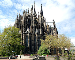
Cologne Cathedral, Germany
Church of the Savior on Blood, St. Petersburg
Temple of Inscriptions, Mexico
As time goes on, the middle ages start to emerge, along with maps. But the maps that people started to acquire aren't like the maps that we used to today, these maps include codes, and relative locations of landmarks. An example of a landmark that people would use in Europe is a Gothic cathedral; because of their massive height, it would be easy for someone to recognize. But the height of the cathedral wasn't only used for people to find their way on Earth, it was also used to help people find their way to Heaven by essentially pointing a big arrow to the sky. With this, we see an emphasis on religion and the trinity within the church by repeating groupings of three throughout. The church was meant to be a safe place, where people could escape the worldly troubles of the "dark ages", so in another words, it was supposed to be the light within the dark. But the light that the church allowed into the space was minimal. The windows were often small, since glass could only be made in small squares, they were often only at the very top of the building, and they were stained to become translucent, instead of transparent. Even though cathedrals seem to follow the same rules, each different region had their own thoughts about what a cathedral should emphasize. For example, Germanic cathedrals have two towers at the entrance and a smaller one in the middle of the building, where the cross meets, whereas in England, the entrance is marked with three towers along with a taller one in the middle. Feeling the constraint of the church and the unsureness of the architectural rules, people wanted to break free and create rules of their own. So they did.
Lincoln Cathedral, England
Cologne Cathedral, Germany
Salisbury Cathedral, England
St. Peter's Cathedral, Germany
Instead of height becoming the emphasis, in the Renaissance, width was. Property taxes were based off of how much land the house took up, and so if your house was wider than it was taller, than it meant that you paid more taxes, which is just one way that people showed off their wealth and power. But to be able to measure one's wealth, there would have to be rules. The Renaissance is one of the first times that architects started making rules about design and how buildings should look to be called "good architecture". With all of these rules in architecture, it is sure to affect the people living in them. During this time, people became interested in rational thinking, and to them, relating back to antiquity for architectural advice was sensible. They borrowed the notion of groves and stacks, along with looking at other geometry. That's when the "ideal city" first arose. The concept of combining circles and squares was started by Leonardo de Vinci when he drew "The Vitruvian Man", which shows how the human body is made using circles and squares. In architecture, the circle in the "ideal city" was considered to be based off of the classical columns and to symbolize the perfection of God. Although both the east and the west followed these rational rules, there was one major distinction between the two worlds. The east saw the value in the past buildings and focused on restoring foundations, rather than tearing them down, but in the west, an old building is just an available spot to put a more modern one. But all in all, the main focus of the Renaissance was rules, which makes sense that the Baroque period would be all about breaking them.
Versailles, France
The "Ideal City" plan
The city of Palmanova near Venice
The City of the Sun as described by T. Campanella
"Vitruvian Man" by Leonardo de Vinci
The Baroque period was able to break away from the Renaissance's neat and orderly rules to create some very interesting pieces of design. These designed objects went throughout different scales, including buildings and objects, mainly. Even though they Baroque design went through multiple sizes, the breaking of the rules were still the same. The main theme in all design then was movement and how to bend the rules of what materials are supposed to do to make them suggest movement. For instance, in the architecture, the facades were created to have more three dimensional objects protruding from them, rather than having a nice clean, flat, front. The same was applied for chairs during this time. The Renaissance chairs were made to fit perfectly inside a box, with the wood being straight and doing what it is supposed to do, but the Baroque broke that box and curved materials out of the box, creating fluidity and curved details. This sense of fluidity made it back onto the architectural level in stairs. Stairs were curved and the steps were placed so that the bottom would seem as if the stone were water pouring out into the open space. Instead of the notion of "frozen music" that was found in the middle ages, we now see the idea of "frozen movement" within all design elements.
Renaissance Chairs
Baroque Chairs
Michelangelo's Laurentian Library stairway, Florence
The Baroque period went on until the early 18th century, and by the time it ended, America was being born. Colonial expansion brought a whole new perspective to the world, but before their perspective was worth anything, Americans had to prove themselves. Since this was a country that is brand new, many believe that it is a savage land with savage people, so the colonial people in America decided to express their sturdy, new found land through architecture. To prove their abilities, the architects turned to classical architecture. For example, the presence of both Greek and Roman architecture is clearly present in Monticello, designed by Thomas Jefferson, by the dome and the use of columns and portico. Another way that colonials showed a strong unity and balance was by showing it in their houses. The faced of the houses were normally symmetrical and materials were continued through out the outside of the house. Now that the 13 Colonies knew they had a presence in the world, they started to compete with the rest of the world in the buildings they designed. Since America was new, they didn't have factories to produce building materials, all they had were raw materials, so they decided to open up trade routes with England to get their manufactured goods. Because of these new found trade routes, people in colonial times wanted to be other worldly; to travel and collect objects from other countries and to bring them back to show off in their homes. This not only proves that they have the wealth to travel, but it also shows that they have obtained knowledge from other countries.
Monticello, Virginia
Triangle Trade Route
Tea Party by Henry Sargent
America Guided by Wisdom by John Janes Barralet
Along with gaining experience and knowledge from other places, they gain new materials from their own land because of the Industrial Revolution, which began in the 1800s. During this time, new jobs were made, and people started to explore new materials that they can create or make useable with the new machinery they built. With these new materials, new architecture arose. Steel was being mass produced to be used to support glass in buildings and green houses. A few year after the Industrial Revolution ended, the United States went entered the Great Depression, and with the Great Depression came poverty, inflation, and lack of trust in the government, so to regain trust, America had to go back to it's roots and show stability like the 13 colonies did in architecture, only this time it is with money. The government showed both symmetry and repetition on the Dollar bill, just like architects showed it in houses. For example, the Great Seal that is on the back of the bill shows an eagle with a palm branch in one talon and arrows in the other, representing peace and war, but the eagle is turned towards the peaceful sign. The eagle also has "E Pluribus Unum" written above it's head, meaning "one out of many" in Latin. This is purposefully stated because the Dollar bill was created when money was scarce, but having a document that says that there are many of this monetary form made the people in the Great Depression feel relieved.
Crystal Palace, London
United States 1 Dollar Bill
United States Great Seal
Wednesday, April 6, 2011
Tuesday, April 5, 2011
Tuesday, March 29, 2011
Reading Response 10
2D or not 2D
During the 19th century, there were a lot of discussions about how design should be. Some people wanted to keep the rules, and some of them wanted to keep the rules that would were created throughout history. Two of the most distinct conversations between architecture was whether buildings should be 2D or 3D. With two dimensional objects, the focus was the surface decoration, like in the Renaissance period. On the other hand, the three dimensional objects focused on breaking the rules and thinking outside the box, like the Baroque architecture.
Even today, the same conversation still continues, but I believe that the two dimensional side won. The idea of surface decoration is so much easier to replicate than carving and molding three dimensional objects. The most common way that our society incorporates surface decoration is by the use of tile. Ceramic tiles are used in both residential and commercial buildings. It is used in bathrooms, kitchens, pool, malls, and even floorings.
Monday, March 28, 2011
Subscribe to:
Posts (Atom)


